How to use Tables in SwiftUI
Written on September 7, 2023
Short on time? View the TLDR version here
In this article we're going to take a quick look at how tables are setup and used in SwiftUI.
Throughout the article I will be using the following structures as sample data for the tables.
struct User: Identifiable {
    let id: UUID

    let firstName: String
    let lastName: String
    let age: Int
    let favoriteColor: Color

    let createdAt: Date
    let updatedAt: Date
}

enum Color {
    case red, orange, yellow, green, blue, purple
}
Creating Tables
Just like a List you can create a table by passing in an array of Identifiable items inside a Table view. In a List this array would be followed by a row builder. That is, a view builder which defines what a row looks like in the list. However for Tables we must instead define the columns of the table.
Below is an example of a simple table.
Table(users) {
    TableColumn("First Name", value: \.firstName)

    TableColumn("Last Name") { user in
        Text(user.lastName)
    }
}
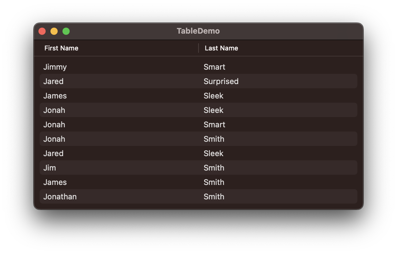
This table has two columns, the first shows the first name of the user, while the second shows the last name. Notice how the Table is comprised of TableColumns. Each TableColumn has a view builder which defines how a cell in the column will look. The builder gets a single item from the array of items given to the Table.
Notice the two different ways of how the columns are created. The first way is a nice shortcut you can use if you want to display a simple String. The latter offers more fine-grained control over the view inside the table cell. You can pass as complex a view here as you want, including interactive views like Buttons. Though I would avoid anything that does scrolling.
Here's how that looks when running on macOS.
Let's add a few more columns.
Table(users) {
    TableColumn("First Name", value: \.firstName)
    TableColumn("Last Name", value: \.lastName)

    TableColumn("Age") { user in
        Text(user.age.formatted())
    }
    .width(40)

    TableColumn("Color") { user in
        ColorView(color: user.favoriteColor)
    }
    .width(min: 55)

    TableColumn("Created") { user in
        Text(user.createdAt.formatted())
    }

    TableColumn("Updated") { user in
        Text(user.updatedAt.formatted())
    }
}
Here I've added some more columns to display more of the user's properties. I've also adjusted the last name column to use the key path initializers. With the other columns I was forced to provide a custom view, since the property that I was presenting there was not a String. You can also see that for the color column, I've provided a completely custom ColorView.
Here is how this table looks on macOS.
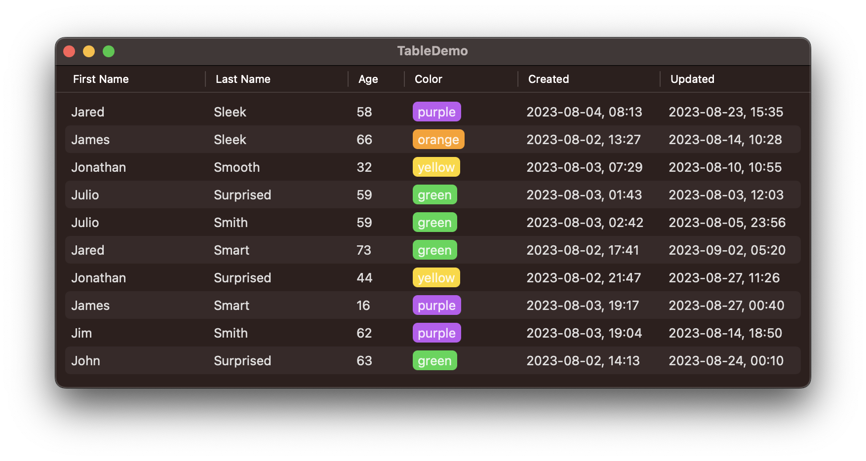
Take note of the .width(...) modifier on some of the columns. This is how the column width is controlled. By default, if there is no width specified on the column, the table will make all the columns have an equal width. While making sure that they fill the whole width of the table. All the column widths can still be dragged and changed by the user.
Overriding the width to a fixed value, such as how we did it with the Age column will, unsurprisingly, make that column's width fixed to that value. However, it will also make the width unchangeable by the user. If we instead specify the width with any combination of a min, max or ideal, it will keep the cell resizable but make sure that it fits into those constraints.
In terms of height, in my experience, the table will adjust the row height to accommodate what is presented in the cell, with a default minimum. The default is similar to what you would find in the Finder app.
Row Control
Passing an array of items directly to the Table should be sufficient for most use-cases. However sometimes it could be beneficial to have a more fine-grained control over how the rows are presented in the table. For example you may want to show a hard-coded set of rows without creating having to store them elsewhere. Or perhaps you want to breakup your rows into sections.
For this we can use an alternative initializer, where we tell the table what the type of our presented item is, and then provide an additional builder that builds a list of TableRows.
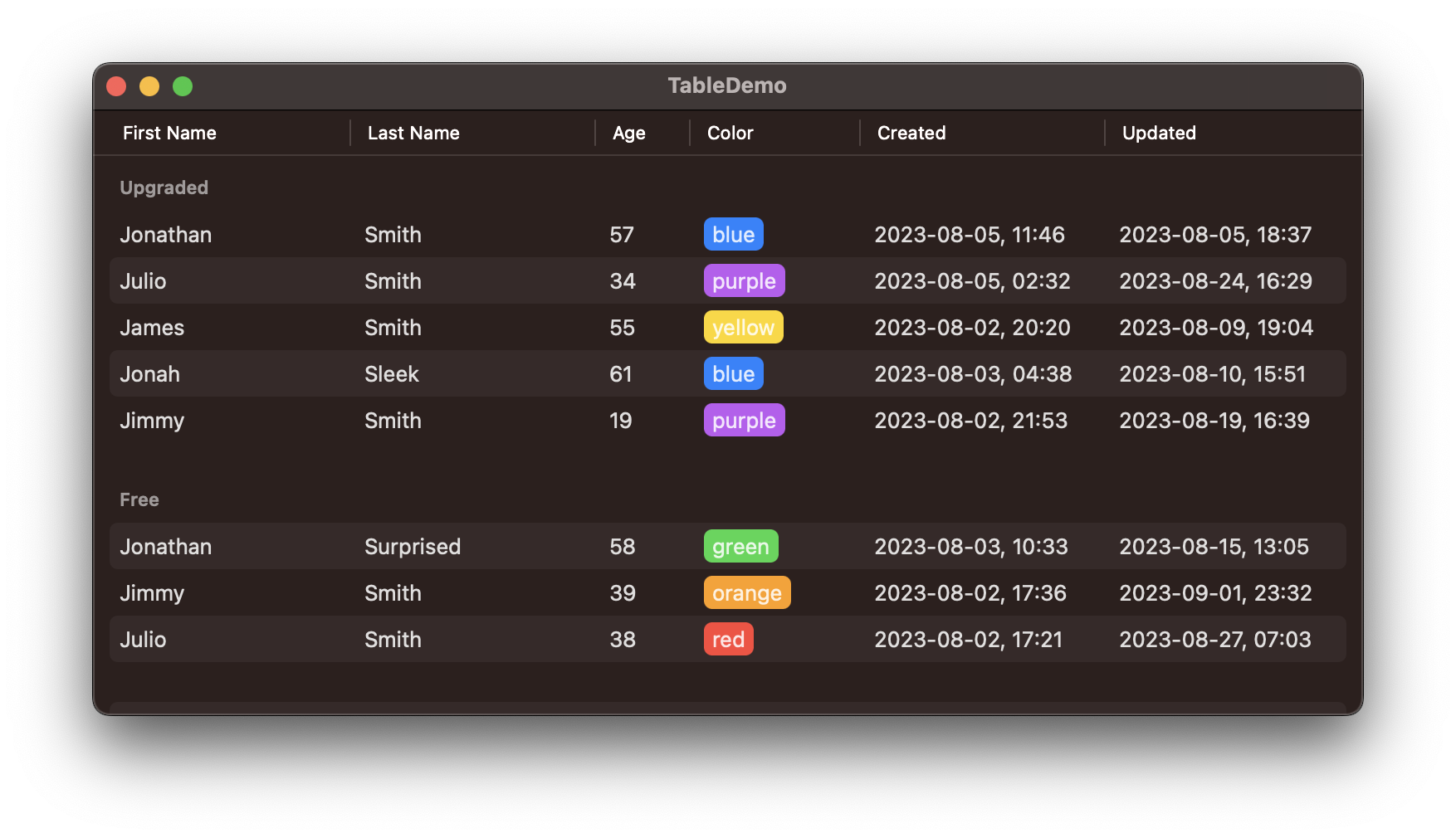
Assuming we have a UserSection struct like below, we could present a sectioned table like so.
struct UserSection: Identifiable {
    let name: String
    let users: [User]
    var id: String { name }
}

var body: some View {
    Table(of: User.self) {
        //...Columns...
    } rows: {
        ForEach(sectionedUsers) { section in
            Section(section.name) {
                ForEach(section.users) { user in
                    TableRow(user)
                }
            }
        }
    }
}
The above code renders to this.
Selection
Selection works pretty much the same way to how it works in Lists. The type of items that you present in the table must conform to the Identifiable protocol. To enable selection, you must have an optional, bindable property of the ID type of your presented item. With that in place, simply pass the bindable property to the selection argument when creating your Table and selection should just work.
let users: [User]
@State private var selectedId: User.ID?

var body: some View {
    Table(users, selection: $selectedId) {
        //...Columns...
    }
}
Whenever a user taps on a row within the table, the row will be highlighted, and the selectedId property will be populated with the row's id value. Clicking on an empty area in the table will set the selectedId to nil. The binding works both ways, so if you were to change selectedId programmatically, the table would update to reflect the change.
To enable multiple selection simply change the optional property to a Set of IDs.
let users: [User]
@State private var selectedIds: Set<User.ID> = []

var body: some View {
    Table(users, selection: $selectedIds) {
        //...Columns...
    }
}
Sorting
Enabling sorting in the table is a bit of a delicate process and is comprised of a number of steps.
First, You must have a bindable array property that contains a type conforming to the
SortComparatorprotocol. For most intents and purposes, you can simply use an array ofKeyPathComparators for this. You pass this array to thesortOrderargument of theTableinitializer.For each column in your table that you want to be sortable, you must specify how that column is to be sorted. This can be done in a couple ways.
Typically every column will tied to a single property that is
Comparable. In those cases you can pass a key path to thevalueargument of the column.If the property backing the column is not
Comparableor the data is backing the column is more complex you can make the column sortable by providing a customSortComparatorinstance to thesortUsingargument. The type of the sort comparator must be the same as the comparators stored in your array from step 1. So if you were usingKeyPathComparator<User>, then this must be the same type.
Lastly, the table having pretty much all the necessary information about how to sort the array of items, you must still sort the array yourself.
If you have access to the entire array of data in the table then you can simply use the .sorted(using:) function, available on Array. This functions accepts a single SortComparator or a list of them, so you can simply pass in your sort comparator array from step 1.
If the data is paginated and fetched from a backend, then you may need to rely on custom sort comparators, to be able to translate that into a compatible sorting specification.
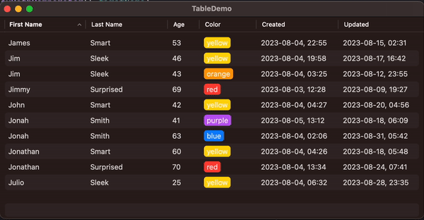
Following the above steps, here's how we would update our table to support sorting.
let users: [User]
private var presentedUsers: [User] {
    users.sorted(using: sortOrder)
}

@State private var sortOrder: [KeyPathComparator<User>] = [
    KeyPathComparator(\.firstName),
    KeyPathComparator(\.lastName),
]

var body: some View {
    Table(presentedUsers) {
        TableColumn("First Name", value: \.firstName)
        TableColumn("Last Name", value: \.lastName)

        TableColumn("Age", value: \.age) { user in
            Text(user.age.formatted())
        }
        .width(40)

        let colorComparator = KeyPathComparator(
            \User.favoriteColor,
            comparator: Color.Comparator()
        )
        TableColumn("Color", sortUsing: colorComparator) { user in
            ColorView(color: user.favoriteColor)
        }
        .width(min: 55)

        TableColumn("Created", value: \.createdAt) { user in
            Text(user.createdAt.formatted())
        }

        TableColumn("Updated", value: \.updatedAt) { user in
            Text(user.updatedAt.formatted())
        }
    }
}
Notice how my sortOrder property starts with a default value, sorting the table first by firstName, then by lastName. This ensures that the table is sorted when it is first presented. The sorting arrows will also be pointing in the right directions when the table is first presented.
Most properties on the User type are simple foundational types that conform to the Comparable protocol out of the box. This is why for most of them we simply specify our sorting using the value argument. However, since the color property is a custom type that does not conform to Comparable, we must take special care here. To make this work we provide a custom comparator that knows how to compare Color values.
Implementing a custom comparator type is outside the scope of this argument, so I leave this as an exercise for the reader. To make usee of the comparator we must jump through a couple of hoops. Let's isolate the piece of code that I'm interested in. This is an excerpt from the code snippet above.
let colorComparator = KeyPathComparator(
    \User.favoriteColor,
    comparator: Color.Comparator()
)
TableColumn("Color", sortUsing: colorComparator) { ... }
Let's walk through this. First we define a KeyPathComparator that points to the favoriteColor property, on User. By default, with no other arguments, the KeyPathComparator will simply compare by that property using the Comparable implementation supplied by the type of the property. Since the Color type is not Comparable this would not work. There is a work around.
For types that do not conform to Comparable we must tell the KeyPathComparator how items should be compared. This is done by passing a custom comparator to the comparator argument of the KeyPathComparator initializer.
With the KeyPathComparator created and assigned tocolorComparator we pass that to the column's sortUsing argument. I've split this into two declaration for readability, but you can inline it in your own code if you wish.
You might be asking yourself, how does the table tell us how we should sort the data? Notice that sortOrder is a bindable property. This means that the table modifies the sort order array, whenever the user changes the sorting in the table. Let's take another look at the bigger code sample above.
Initially the sort order contains two comparators, first sorting by the first name, second by the last name. No direction is provided, so the default of forward (ascending) is used. Now let's assume that the user clicks on the Age column. This makes the table sorted by the age property, in ascending (.forward) order. What the table does is it looks through the current sort order to find an existing comparator for age. Not finding one it creates a new comparator, starting with the .forward (ascending) direction and inserts that to the beginning of the sortOrder array.
This works in tandem with how Array's sorted(using:) function works. Since that will always look at the first comparator in the list and sort by that. If it so happens that a set of items are equivalent according to the first comparator, it will ask the second comparator to compare. If they are equivalent according to the second as well, it will ask the third, and so on. This is also a neat and straightforward way of achieving "tiered" sorting, even outside of SwiftUI tables. However this behavior is assumed to be supported in tables on macOS, so if you are rolling your own sorting algorithm, make sure you take the "tiering" into account.
Now let's assume that having sorted the table by age, the user clicks on the First Name column again. This time the table will go through the sort order again. However since there is an existing comparator for firstName it will simply move it to the top. This causes the array to re-sort itself according to the new sorting rules. If the user were to click on the First Name column one more time, the table would replace the firstName comparator with the same one, except sorting in the other direction, causing the table to reverse.
Here's the table sorting in action.
Conclusion
There's still more to tables such as styling and column composition that I'm hoping to cover later. Hopefully this article shed some light on how tables work in SwiftUI and how best to use them. I remember when I first started using them I found it very daunting to figure out how all of these features worked. Something like this article is something that I really could've used back then.